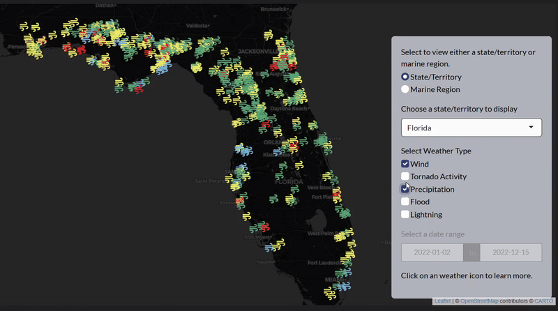
2022 Storm Events Interactive (R & Shiny)
Developed August 2023
1st Place 2025 CoDEx Winner
As part of a class project, I wanted to create a visualization that could help educate the public on the effects of climate change in the U.S., especially in my homestate, Florida. While storm events are highly documented, no widely accessible tool exists to make them easily digestible. This interactive visualization enables users to explore the distribution of significant weather events in the United States, nationally and regionally. They can also see damage statistics and can filter across any metric and weather type. The data, sourced from the NOAA, includes major weather reports across states, territories, and marine regions for 2022. However, it can be adapted to view data from any year or multiple years.
I later submitted this project to Northwestern’s 2025 CoDEx Research Symposium, earning 1st place in the interactive visualization category.
This visualization tool is built using Shiny and R and incorporates many packages such as ggplot, leaflet, and interactive tables.
Developed Summer 2024
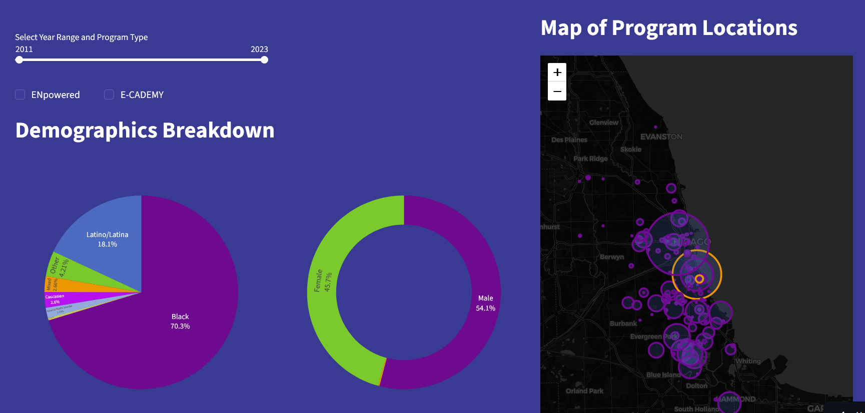
As part of my 2024 summer data sciene internship, I worked with a team to design data dashboards for the chicago non-profit Project SYNCERE. Project SYNCERE is an afterschool STEM education program aimed towards underrerpesented communities, and requested better ways to visualize how their program was doing. With their help, I developed two dashboards: and internal one that allowed their team to view demographics, attendance, and financies to see their strengths and where they needed to improve, and an external one that showcased their program to potential new families and sponsors.
The internal dashboard was made with Domo.com, an data interactive tool similar to Tableau, while the external dashboard was made with Python Streamlit, a python alternative similar to an R Shiny app. Out of Project SYNCERE’s wishes, I have hid most of their sensitive data and code from the public, but my dashboards can still be viewed below.
Note: Domo.com and Streamlit frequently change some of their functionality overtime. Therefore, the above dashboards may not display or be spaced correctly. Please notify me of any major disturbances or errors.
Airport Takeoff Data EDA (Python)
Developed Fall 2023
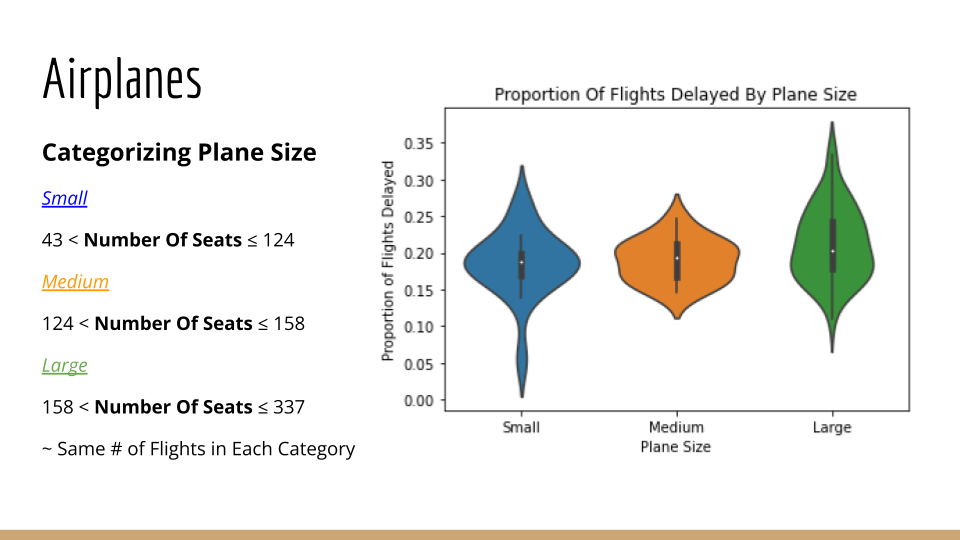
This is an EDA project I helped create during my first data science class at Northwestern. The graphs were built in Python, and my task (slides 25 - 31) was to explore whether plane size across different airlines had an effect on whether the flight would be delayed. The presentation can be viewed below.
Manhattan Leasing Prediction Model: 2025 DataFest Entry (Python & Tableau)
Developed April 2025
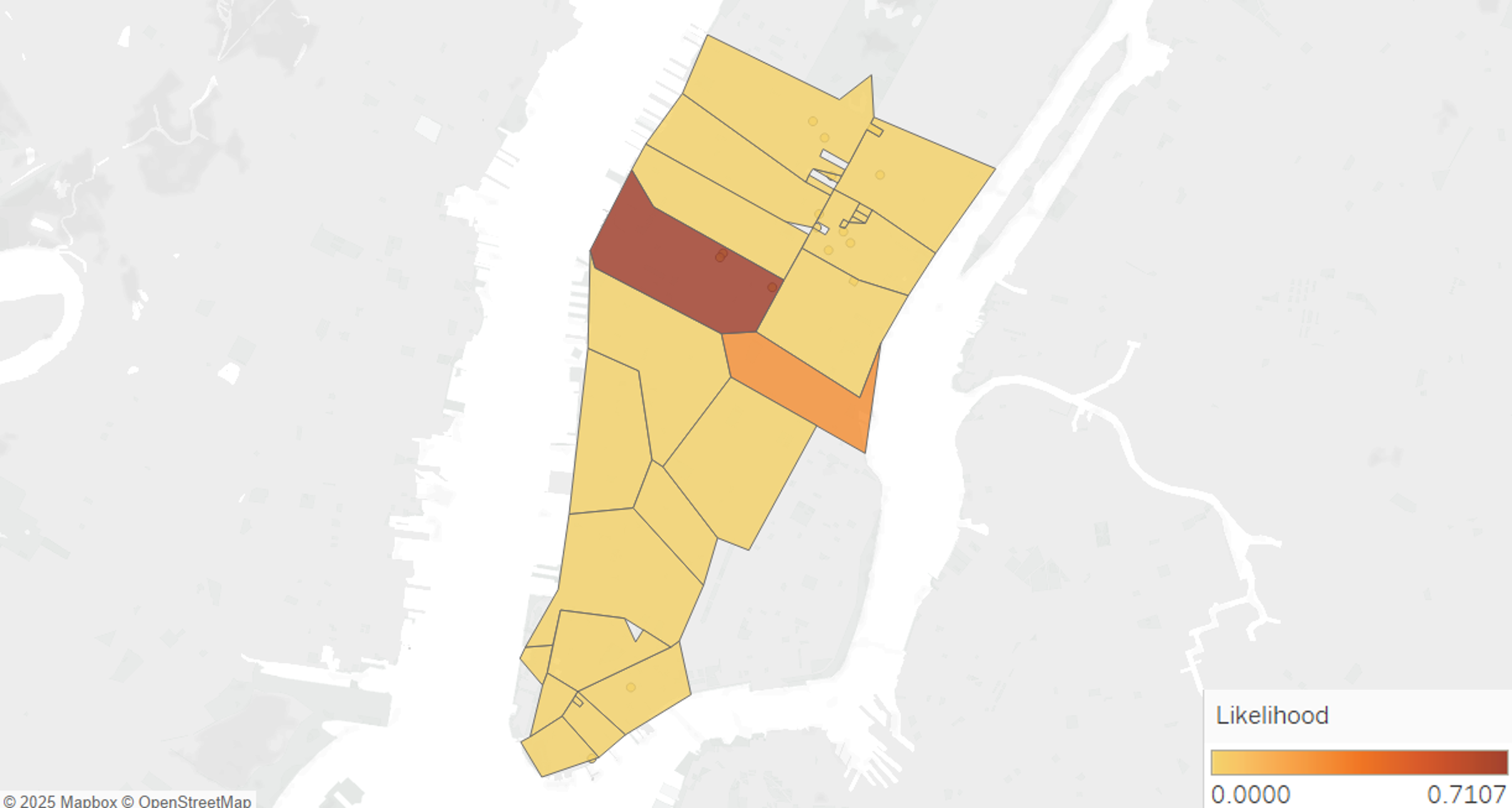
The 2025 Northwestern DataFest competition involved using leasing data from major cities to determine advice for businesses looking to rellocate. Our solution was a leasing prediction model, which allows businesses to enter in attributes they cared about (businesses type, square footage, job opportunity, crime rates, etc.) and get predictions on where it is best to lease. Despite my other team members having no data science experience, I helped manage and strategize our strengths evenly, developing a final model with 96% test accuracy. We restricted ourselves to Manhattan, as that is where most data was available, but could be extended to other major cities as well.
Our model was built in python and used a CatBoost classifier. We also used Tableau for EDA analysis.
Airbnb Models (Python)
Developed Winter & Spring 2024
3rd Place in Error (Regression) , 5th Place in Accuracy (Classification)
As part of a project in the Northwestern data science sequence, I programed models based on AirBnB data. The first model from Winter 2024 was a linear regression model that predicted the price of AirBnB’s and placed 3rd place overall for lowest test RMSE, although this Kaggle leaderboard is now gone. The second model from Spring 2025 was a classifer that could predict whether a given Airbnb was from a host or a superhost. The model placed 5th in my class overall, and it’s leaderboard can still be viewed below. This final model was built using CatBoost in python.
WildCards: 2026 WildHacks Entry (Python, React, Supabase)
Launched Spring 2026
As part of the 2026 Northwestern Hackathon, I was part of a team that developed a sports trading card game with the object of bring the trading card experience to the digital world. Users could collect team cards by going to stadiums, trade with friends, and engage in battles using their collections.
The project was built using React, Vercel, and Supabase. My contribution involved created python data crawlers that scraped information about sports players, photos, and team information to use to build an extensive database of trading cards.
Note: this app is continuing to be expanded upon, and updates are made to appearance everynow and then.
CanvAssist: 2024 WildHacks Entry (Python)
Developed April 2024
As part of a 2024 Hackathon entry at Northwestern, I helped build CanvAssist, a scheduler that connected to user’s Canvas profiles to automatically determine a suitable order to complete their tasks in. My contribution was creating a simple algorithm that organized assignment data based on its points, data, and how long it was expected to take to determine an overall ranking.
Single Player Poker (Python)
Developed Fall 2022
This is command line poker game built in jupyter notebook that I created during my first class in python at Northwestern. It allows users to bet, call, and raise against the computer, and determines who wins automatically.
The Expressibility of Neural Networks for Regression and Classification Problems
Written Winter 2026
The following is a summary of notes taken from the Mathematical Approaches to Neural Networks class at Northwestern during my senior year. The report gives details of theorems that showcase how neural networks are capable of modeling regression and classification problems in machine learning through various universal approximation theorems and results on VC dimension.
Music Networks Report: Mapping Genre Preferences Onto A Social Network (Python)
Written Winter 2025
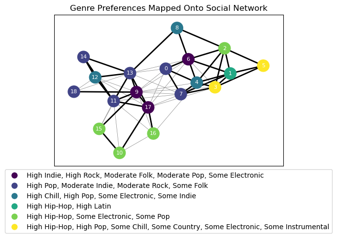
During a Music and Algorithms class at Northwestern, I created a report that mapped music genre prefences onto a social network. The report aimed to see how social connections may influence music profiles. I first gathered data from my own friend group on social connections and music tastes, then used a KNN clustering algorithm to categorize music profiles into music genres. The genres were then mapped onto graphs showcasing social connections. I also used other mathematical tools such as Markov Chains to understand how music may “spread” throughout the network.
The complete report and code used can be viewed below.